Monday, 5 December 2011

Evaluation 4

How did you use new media technologies in the construction and research, planning and evaluation stages?


During all stages of our project, we used:

Safari and Mozilla Firefox were used on both the Mac and the PC when surfing the web during our research stages.For example when we were looking for a recording company or when we were using social networking sites.
Timeglider to help us create our time lines for the 'history of a music video'. A process which took a while to figure out but gave us a choice of many fonts colours and pictures. From this, we could present simple facts in a fun way!
Bubbl.us to create a brainstorm chart of all our initial ideas for the video. This layout was very effective and from it we could see how our thought could lead on to a new idea.

Surveymonkey.com to show the audience research responses and results in a colourful and creative way. It was then posted on FacebookThis meant the survey was available to a wide range of people and we could collect many different answers. The responses however were  from a public of the similar age range and so it was hard to access what a younger child or older person would have answered.
Power Point for the presentation of our initial ideas and the making of audience feedback bubbles. This was I believe an original and colourful way of presenting our research and planning.
Youtube to search for an unsigned artist or band and also for music video inspirations. Youtube has a very wide variety of music genres and songs. As well as 'official music videos', you can find videos in which fans have created to a particular song. These people often have very original and creative ideas! We also used this programme when having trouble editing on Final Cut Express. All we had to do was type in 'tutorial' into th search box and 'voila!' theres all the help you need!


Using Youtube, I also learnt how to use Go Animate!. This programme, is a resource that allows you to make an animated video. I used it to create an overall video on my 'positive feedback'. You create character's and give them text to repeat out loud, it's a great way of producing an entertaining way of giving out information that may be boring reading from a long wordy paragraph!


Microsoft Office Word when looking for a font for the magazine and digipack. The newest version on this programme offers a wide range of fonts and so was very helpful when I was going through 'trial and error'!
Picasa to modify and change colour and size of any pictures we had for the magazine and digipack. This programme is one of the best for picture modifications, it however was only available on my PC at home and so I could not use it whilst at school in lessons.
A camera and tripod for the filming of the video. We, OF COURSE, had technological difficulties with the battery of the camera running out and an unstable tripod, we however did the best with what we had!
A digital camera for all the photography needed. Photos were taken when we were creating our storyboard which then went on to become our animatic! When we needed 'couple pictures' for the narrative aspect of the music video. The quality of these pictures was very good as it came from a top camera! This however didn't contrast so well with the school filming camera's and so we had to fiddle with the colours and brightness to make them look similar.
Final Cut Express for the making and editing of our music video. This was a programme new to us and so made us all believe that it would be impossible to work out! It was however rather straight forward and provided many different and new effects and transitions.

Itunes for the import of the song. I also used it when searching for my unsigned song. What i did was download a few songs from youtuve and added them to a playlist on my itunes. From then on, I played them through and finally decided to go with 'She Was Mine'.
Blogger was used during all stages of the project, when it came to blogging posts about the research, planning, making and evaluating. Blogger is a very good programme, it is easy and simple to use and provides you with many possibilities of layout and design. I, however, experienced some difficulties when it came to adding pictures and links to my posts in which it took a lot of time to load. My only solution for this was to leave it until I was on my own pc at home - where it took a matter of a few seconds to upload!
Fotosketcher is a programme I newly discovered , just in time to be used during the creation of the digipack. With it, you can 'turn photos in to art'. I for example, used the effects of 'pencil sketch', 'filter' and 'oil painting'. It gives the images a nice glow and original touch. This programme unfortunately cannot be accessed on a Mac and so I downloaded it for free on my laptop and did the work from there!
Imovie was used on several occasions. This was when we had filmed footage during our reserach and planning stages. For example our explannation of the storyboard animatic and later, the CD Digipack research conversation. We used both the camera and the tripod OR simply, the webcam on the Mac.

The Mac itself enabled us to use programs such as Photobooth and Iphoto to help us with recordings of our research stages but also for pictures used in the music video itself! As we had used the MAC during our AS year, we had grown familiar with its programs and ways of working!


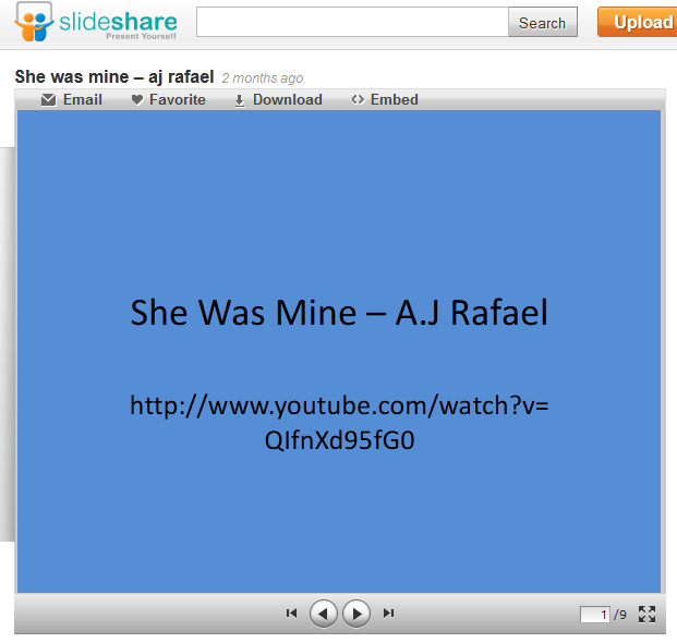
Slideshare was used earlier on when I created the brainstorm and pitch powerpoint and loaded onto this website. I unfortunately experienced technical difficulties and so the clip was unable to be posted on my group blog. And so instead, I layed out the power point slides, printed the screen, cropped it and posted it as a picture onto my blog.

Paint was used on several occasions. It is often the easiest place to crop and picture to then be imported somewhere else like the film itself or the blog. All in all, it was very helpful.

Evaluation 3

What have you learned from your audience feedback?

The information below is from the responses we received from our audience feedback. We handed out a forms to be completed by our peers. They could comment on the visuals, sounds, framing, editing, transitions, costume, colours, and overall opinion on all three of our pojects.


 The Music Video
IMPROVE: Having a few gaps in the video, it was hard to fully analyse the project. However, footage was filmed straight away and was ready to fill in all the spaces!
Wanting our 'memory narrative' footage to be in black and white it then meant the video was rather dark and so from this, we brightened some shots and added bright colours such as a sunny landscape!
Adding transitions meant the video flowed better and wasn't just a 'shot after shot'. 'Some shots are shown for too long' was a comment that was made several times by our audience, and so from this we went back to our editing and cut some shots in the middle and placed new footage in between of them.
Another comment made was about the lip-syncing. One of or possibly THE most crucial aspect in a music video, it was important that our performance footage was spot on and in sync.

GOOD: A positive comment made was about the variety in shot distances and how we used shots such as close ups or long shots.
The black and white effect was appreciated because it reflected well the story of the narrative and how it was in the past.
The stop motion was the favourite aspect of our video by more than a dozen people. It was influenced by a video we had previously discovered but we added a twist to it to make it original.
Another positive comment was on the costume and its effectiveness. Its 'classiness' matches the 'classiness' of the song itself and its sound and so was much appreicated by our audience.

The Digipack
IMPROVE: Our original idea was to show images of love with the colour of red. This however made some audience members think of blood and horror so that was out of the window! We then replaced it with an image of the artist, the young A.J Rafael. This meant it would be appealing to the audience members such as young teenage girls!
The font was said to be too blocky and didn't relate well to the genre of the music and so I changed it back to my original idea of font 'pristina' where it flows well and links in better with the indie style.
It was said to be too boring without any colour and so what I the went on to do is download the programme of 'Fotosketcher' in which 'turned my pictures into art' where I could  add brightness, colours and contrast.

GOOD: Adding the guitar in the inside left of the digipack would imply he is his own musician and is very talented. The back picture was one very much enjoyed by our audience. They said it was 'original' and 'bright' and reflected our them of love very well! The second ans final trial's front cover is a picture of the artist and his guitar. Thie was appreciated because it was vibrant and attracting!


 The Magazine
IMPROVE: Comments towards the font were made, some claimed it was too small and could not be seen. This made sense as when looking through a magazine, you want the text to jump out at you! And so, we went back and made the font bigger and bolder!
Like the digipack, the comment of lack of colour was made once again. And so, the picture was put into Picasa and was brightenend and made to emphasise on the pink of the heart in the image.

GOOD: For the magazine cover, we used the most liked and appreciated picture from digipack. By recycling this picture, it meant that because it is so memorable, it will be easier for the public to then go out and find it in the shops! The picture which is of the 5 strangers holding up love heart posters held up in front of their faces represents the theme of 'love' very nicely and some even claimed it was 'clever' and 'funny'.
It was said to be 'laid out nicely' and so no changes were made to the orientation of the text or the picture were made.


A short animatedYoutube's 'Go Animation!':

Evaluation 2

How effective is the combination of your main product and ancillary texts?

Our music video genre being 'jazzy indie' has created a down to earth approach and a certain brightness to the whole project. The video being a balanced mix of performance and narrative, we wanted to attract our audience by the form of 'classyness' and 'prettiness'. The narrative following the story of a boy who reflects over a relationship that has not ended very well but has certainly taught him a lot about life and its obstacles. And so he proceeds to look up and positively. This is why we named the album 'rise above it' as we thought it related well to the theme of his song but also was broad enough to relate to his other music. It also was effective, we believe, because all members of the public can relate and understand it!
After group discussions and brainstorms, we then went off to tackle the creation of the ancillary products. Izzy proceeded with the editing, Jack the magazine advert and I the digipack.

The Music Video


The Digipack


This is our first trial at our CD Covers. The feedback was mixed because of many reasons. Firstly, The front was nice because it was simple and effective, the heart on the hands however was a bit smudged and so hard to tell what it was at first! Then, the back cover which was the favourite! It was original and stated all that had to be said and so a KEEPER! :)The inside right and left were said to look like something you'd find in a horror film because it connotes blood, and so this idea was scrapped!


This is the first back cover trial. It however received some negative feedback. This was concerning the colours of two contrasting whites (at the very top and the start of the image). The font was also said to be too small and rather hard to read. And so, this cover was scrapped but influenced and helped us create the final outcome of the back cover. (later seen in this post...)


From all of this... I then went on to create:


This is the front of the CD. We decided to go for a picture of the artist because 'sex sells'. Our audience would mainly be young teenage girls and so having his face on the cover would very much help the sales! It is also eye-catching on a shelf in a shop because the artist is new and has not been seen before! We decided to include the guitar into the frame because we wanted to make it obvious to our new audiences that it is also him who plays the music as well as him singing. This proves that he has real talent! A size 20 font in 'Pristina' was used for both the artist and album names. 'Rise Above It' was put at the top because it made sense for it to be risen!!

This cover was influenced by John Mayer's 'Heavier Things' album. We researched his cd covers as he is an artist very much like A.J. This cover is, however, rather 'in your face' and a little aggressive. We decided against this because it is a debut album and the artist is new and so we approached it more innocently.


If we then proceed into opening the CD, we come to:


Our inside left being a picture of A.J's guitar emphasises his musical abilities once again. His message and thank yous have been written into the guitar, showing a nice colour contrast between the orangy yellow of the instrument and the black bold and italic writing. The message is friendly and family orientated which portrays the artist as a 'down to earth guy'.


On the right we have:


An image which hopefully does NOT connote blood and horror but rather 'love'. This being our main theme of the entire project. The repetition of the hearts are there to appeal to our younger and mostly female audiences. It however, being a picture of a couple holding hands, suggest relationships and so both genders can relate to this. As you pick up the CD itself, the heart, being in the middle, will stay put on the paper. This was intentional to then imply that once the CD is put back in its place, it is 'complete' and the heart is restored. We used a black background to emphasises all the attention on the brightened hands and the red heart.


Turn it over and you get:


A picture that was much appreciated from our first trial. It shows the image of 5 individuals holding up a love heart poster in front of their faces.Hiding their identities was done for two reasons. Firstly, to suggest that love can happen to anyone! And secondly, that the reason they are hiding behind the heart poster is possibly because they have experienced bad memories from love and relationships. This whole image emphasises once again on our theme of 'love'.
The modern and casual costumes imply a youth to it all. This is effective as it reflects on the young age of the artist and his new arrival in the industry.
Between the people, you will find the song titles in 'Big Bear' font. This gives the imagery of graffiti on the walls behind, emphasising even more on the 'youth' of the album and artist. 
The colour of yellow here was used to help create the 'indie' mood and genre of the artist. 
The Sony Music Logo and the barcode or on the bottom side. Essential for the sales!

This image was influenced by the Wombat's newest album cover of 'This Modern Glitch'. They are a band of similar genre of music as our artist,  A.J Rafael, and so share similar aspects when it comes to covers, colours and creativity. They however, portray a certain randomness to they image (picture of sofa). Our posters reflect our theme of love and so it is more obvious.


The Magazine


This is our magazine cover. We decided to use the image from the digipack's back cover as this was the favourite of many of our peers! We have decided to alter the colours however so it is easier on the eye. Repeating the picture means it will help the public find the CD on the shelves much easier because they will be familiar with it. The cover includes two 'star reviews' from two music magazines, NME and Uncut. These are two magazines in which relate well to our genre of music and so that is why we have chosen to add them on our magazine cover. There is a small HMV logo on the bottom left. This was an aspect we found on many of the magazine covers we analysed. It is helpful to the public because it informs them as to where they can purchase the cd. The pink of the logo does not clash with any other colour as we have the pink in the hearts on the posters. 
The date of 'coming out' is at the very top, just above the artist's and album name. This is in bright orange as it connotes happiness and a 'down to earth' approach. 

Also, the size of the cover is on purpose. For a new artist who has not received much money yet for his talent, we decided to make his advert on 1/2 or a 1/3 of an A4 page. This means it costs less for the advertising, and more money can be spent on other aspects of the coming out of his debut album!

We did not want to add any more text. This is because nothing else needs to be said! The names, coming out date and a couple of reviews and voila!


THE COMBINATION OF THE DIGIPACK, THE MAGAZINE ADVERT AND THE MUSIC VIDEO:
1. The sharing theme of 'love' conveyed by the love heart posters, the love story narrative in the music video and the holding of hands on the inside left of the digipack.
2. The repetition in use of the back cover and the image used for the advert.
3. The soft and pale colours used that reflect the 'jazzy indie' genre of the song. These colours are also used in the music video, as well as black and white. Colours found on the digipack. The colour pink use in all three products to emphasise on the theme of love and relationships.
4. The hidden identity of Jack on the image of the magazine advert who is also the main male character in our music video as well as the face on the front cover of the digipack.
5. The incorporation of the guitar in both the music video and the digipack to emphasise on the musical talents of the artist.
6. The reflective facial expression of 'looking back' at a memory and the past seen throughout the music video and also on the front cover of the CD.


I feel that both our digipack and magazine advert have been successful, combining well with our music video,the theme of 'love', the pale soft colours and the use of musical instruments.

Evaluation 1

In what ways does your media product use, develop or challenge forms and conventions of real media products?


1. We are introduced to the artist in this shot, where he is singing into his microphone and playing his guitar. It was essential to show our artist physically playing his instrument because we want to present him as a musician with a pure and actual talent!

This is a caption from Mcfly's official video of 'That's the truth'. In which shows a similar shot, setting and costume as ours.


2. This black and white shot shows the narrative's couple slow dancing together to the song- which is being performed in the club where they are by the two artists of the song! The girl here is in a black lace dress, a classy look that matches the feeling and sense of the melodic song. The lighting here was low to create the sense of intimacy.

Here is a capture from Johnny Cash's 'Hurt' video in which the song reflects memories and the past. This footage is in added colour to imply that it is in the past. We used a similar approach for our music video.


3. Stop Motion of a picture brought together. The image is of the couple holding hands in a field with the lovely sun shining and a blue sky. The setting helps create the mood of the shot, a happy one!

The stop motion was influenced by David Choi's music video of 'That Girl'. A song that is very much like ours.
We used Goodwin's sixth rule of 'There is often intertextuality' in which we directly used the concept of the stop motion.


4. This shot shows our setting of the hill, where we we offered wonderful colours by mother nature! The brightness of it was then highly reflected even with our black and white effect. This was added to imply that the narrative is a memory. That the couple we see in the frame was a couple from the past and may not be together anymore. Songs about love of the same genre as us have shown similar ideas, often with the main male looking back at a relationship.

This caption, from My Chemical Romance's 'I dont love you', shows the setting of a hill and landscape. We used a similar aspect however we challenged it and because our genre of music is more up beat and happier, we added brightness to our shots.


5. Fade into medium shot of performance and showing the 'featuring artist' and his instrument. The black tie costume gives a classy look and jazzy feel to the video. This is a direct link to the 'jazzy' genre of the song.


Jack Johnson's 'Taylor' showed the artist playing his guitar whilst singing. This is a criteria we also had in our music video.


6. This shows the artist and also our main male character writing on a window 'i miss you' which links in directly with the lyrics of the song at the time that it is shown. This also reflects our maintained theme of 'love'. The relationship between visuals and lyrics is the second Goodwin's Rule. Many songs of our genre (jazzy indie) have proving to be about love, its difficulties but also its advantages.

Here, a capture from Adele's 'Make You Feel My Love' in which she sings about missing her partner. Our song reflects this same theme, we however decided to portray it through visuals AND lyrics.


7. The close up of the guitar does many things. Firstly adds colour and brightness. It also emphasises on the genre of music and highlights the talent of the artist which is something we really wanted to portray in our video.

John Mayer is a musician very much like A.J Rafael and so this video (Your Body's a Wonderland) shows many footage that was also in our video. Like this one here, a close up on the guitar.


8. One of Goodwin's Rules is about the reference to a female and more in particular, her body. With the innocence and our down to earth approach to our music video we did NOT want to include any footage of 'voyeurstic treatment of the female body'. This was too aggressive and so we decided to challenge it and rather include footage of a pretty female character.

Jennifer Lopez here has been portrayed as a beautiful women, she however has been aided by costume and lights and make-up. This materialism mise-en-scene was chosen not to be used in our video because of the genre of our music.


9. The last shot shows the main female character walking away. From this we get a relationship between lyrics and narrative as the song is about the girl leaving the boy. We attached a 'fade out' transition to this shot for a closure to the song but also the story. We also, using our editing skills, added a layer of a previous shot of the artist's eyes. This implies that he is watching the girl walk away, a memory from the past (emphasised by the black and white effect).

In this caption, from Taylor Swift's 'Picture to Burn' we see her walking away at the end of her video. She sings about a relationship that did not end well, a theme in our song too. And so, without use of lights and big expressive costume, we developed the use of the 'walking away' to end our clip.